Among the navigation items on the W3C homepage is a Mission page. On that page, accessibility is listed as the first principle. Thanks to this background, web standards specifications always consider accessibility together.
The power of the Web is in its universality. Access by everyone regardless of disability is an essential aspect. – Tim Berners-Lee, Accessibility | Our mission | W3C
If the web content you want to create sufficiently reflects the structural meaning of HTML, most accessibility is guaranteed. However, when implementing complex UI components that HTML does not provide by default1, there is a limitation where accessibility can be omitted.
This limitation can be supplemented with WAI-ARIA, but improperly used ARIA can actually degrade accessibility, so caution is needed.2 This is because it may behave differently than originally intended.
Notes on ARIA Use in HTML | W3C provides a good introduction to when and how to use ARIA and situations where it should not be used. I recommend reading it.
This article covers how to properly utilize WAI-ARIA when complex UI state representation is needed. I’ve prepared two best practices to help with explicit UI state management using ARIA State (representative examples include aria-invalid, aria-expanded, aria-selected, etc.).
Class selectors have the characteristic of being more versatile because they rank higher in CSS Specificity3 than element selectors but lower than ID selectors. Because of this characteristic, defining CSS rules by class names has become a common practice among web programmers.
However, the W3C CSS specification recommends avoiding the practice of replacing HTML’s meaning with class names, as class names do not carry meaning unlike HTML. In my personal opinion, beyond HTML, CSS pseudo-classes also provide sufficiently referenceable built-in states such as :checked, :default, :disabled, :invalid, :required.
CSS gives considerable power to the “class” attribute, authors could conceivably design their own “document language” based on elements with almost no associated presentation (such as DIV and SPAN in HTML) and assigning style information through the “class” attribute. Authors should avoid this practice since the structural elements of a document language often have recognized and accepted meanings and author-defined classes may not. — “Class Selectors” Selectors Level 3 | W3C4
In 2023, I worked on frontend development for a content submission web service called “Glyph” at a startup called “Penxle Company”, starting 3 months before its launch. I always worked with care to ensure that the features provided properly supported web accessibility.
I also wanted to persuade surrounding colleagues to care about UI design faithful to HTML’s basic functions and accessibility standards, so I consistently shared review opinions on accessibility standards such as WAI-ARIA across the company. As a result, my opinions were significantly adopted in the web service development guide.5
For the first best practice, I’ve prepared the “content pricing feature” from the UI created in “Glyph”.
UI Requirements for the “Content Pricing Feature”#
Prices can only be entered in multiples of 100, and can be set up to a maximum of 1,000,000.
Any other input is invalid.
Validation is delayed until after form submission. For invalid states, the following feedback is provided:
The input UI’s border and background color change to red with transparency.
A Tooltip UI appears to provide a detailed message about why the input is invalid.
For the validation feedback in the above requirements, you can define meaningful CSS rules by declaratively using ARIA State without injecting arbitrary class names.
I’ll show you a simplified version of the UI I implemented at the time. (The original can be found at penxle/withglyph#1296.)
Note: The @ui/Tooltip module is a hypothetical Tooltip UI component assumed to help understand the pseudocode.
<scriptlang="ts">importTooltipfrom'@ui/Tooltip';interfaceProps{errorMessages: string[];}let{errorMessages}:Props=$props();letinvalidPrice=$derived(errorMessages.length>0);consterrorTooltipId='price-input-error';</script><Tooltipenabled={invalidPrice}><!--
aria-live="assertive":
Assistive Technology tools immediately read content whenever it changes inside the element.
--><spanslot="message"id={errorTooltipId}aria-live="assertive">{errorMessages.join('<br/>')}</span><inputname="price"aria-errormessage={errorTooltipId}aria-invalid={invalidPrice}/></Tooltip><style>input[name="price"][aria-invalid="true"]{border:1pxsolidred;background-color:rgb(255,0,0,0.5);}</style>
When an invalid value is entered into the price Input UI, the aria-invalid attribute is injected as true. Looking at the code inside the <style /> block, when the aria-invalid attribute value of the price Input UI is true, a red colored border and rgb(255, 0, 0, 0.5) background color are styled.
The second sub-item is “feedback that displays error messages with Tooltip UI”. When delivering detailed error messages using a Tooltip, you can specify the relationship between the error message and the input field by assigning the aria-errormessage value as the constant value errorTooltipId, which is the ID of the error message element.
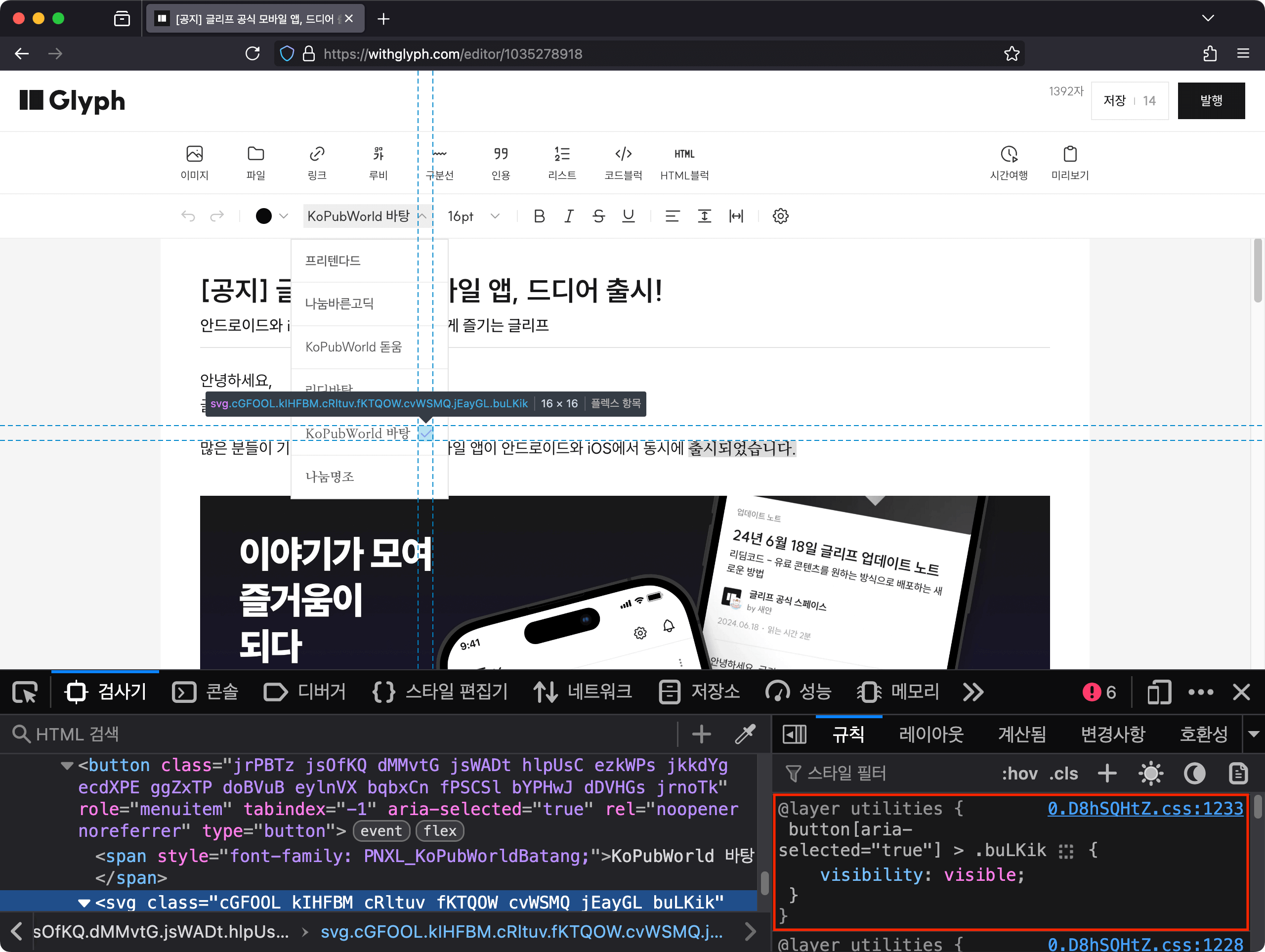
The Select UI’s button label displays the current cursor’s font information.
When the Select UI button is pressed, the listbox opens. The button’s background color changes to gray, and the 🔼 icon next to the button label rotates 180 degrees.
Display a check ✅ icon to the right of the font item in the list that matches the font selected by the cursor in the editor.
Note: The @ui/Toolbar module is a hypothetical toolbar UI component assumed to help understand the pseudocode.
aria-expanded is a boolean state that indicates whether the UI controlled by a specific button is currently expanded or collapsed. For Select UI, if the list is collapsed the attribute value is false, and if expanded it is true.
button[aria-expanded='true']{background-color:lightgray;&>i.chevron-icon{/* Rotate the 🔼 icon next to the button label upside down */transform:rotate(0.5turn);}}button>i.chevron-icon{transition:transform0.5s;}
The above CSS rule styles the font selection button’s background color as lightgray when in the open state. And while rotating the 🔼 icon next to the button label 180 degrees (rotate(0.5turn)), it specifies a 0.5 second transition effect for that element’s transform property.
This results in a transition animation that rotates clockwise to change to a 🔽 icon playing for 0.5 seconds.
ul[role='listbox']{display:none;}button[aria-expanded='true']+ul[role='listbox']{/* top, left specification code omitted: implemented with popover library at JS execution time */display:block;position:absolute;}
The above CSS rule controls whether the listbox is opened by using the button’s aria-expanded state as a selector. When the button’s aria-expanded attribute value is true, the listbox wrapped in the ul element located immediately after via the next-sibling combinator + is applied to appear on screen.
Through this selector combination, control over whether the listbox is opened can be statically separated without performing it directly at JavaScript execution time.
li[role='option']>i.selected-icon{visually:hidden;}li[role='option'][aria-selected='true']>i.selected-icon{/* Display ✅ icon next to font name when selected */visually:visible;}
aria-selected is used to indicate whether an item is selected. Looking at the code block above, CSS rules are defined to visually display or hide the ✅ check icon based on this attribute for all option elements in the list.
Therefore, feedback about the selected option can be conveyed visually along with the ARIA attribute, providing equal information regardless of whether the user has a disability.
Aside: I consider it a bad code smell when default state CSS rules are overridden by other rules according to specificity, so I prefer defining styles separately according to branches.
- ul[role='listbox'] {
+ button[aria-expanded='false'] + ul[role='listbox'] {
    display: none;
}

button[aria-expanded='true'] + ul[role='listbox'] {
  /* top, left specification code omitted: implemented with popover library at JS execution time */
  display: block;
  position: absolute;
}

- li[role="option"] > i.selected-icon {
+ li[role="option"][selected="false"] > i.selected-icon {
    visually: hidden;
}

li[role="option"][selected="true"] > i.selected-icon {
  /* Display ✅ icon next to font name when selected */
  visually: visible;
}
Both of the attributes below, like the Relationship Between Input UI and Tooltip from the first case, can be used as useful clues for constructing automated web browser tests with the same benefits.
aria-controls is an attribute that specifies that another HTML element is being directly controlled. In the example button, aria-controls references the ID of the listbox that appears when the button is clicked.
This helps Assistive Technology users, such as those using screen readers, clearly understand the relationship between the button and the controlled UI.
aria-activedescendant is used in complex UIs to communicate to Assistive Technology which child element is virtually activated without actually transferring focus.
Feedback during list navigation: When navigating the list through Assistive Technology tools, information about the currently active item is always available.
If you’re curious about best practices for keyboard operation, please refer to the conversation in penxle/readable#1128 that I shared during the process of consulting an external Open Source project.
You can see that this writing method allows for clear separation between state and CSS rules in frontend UI. Summarizing the characteristics into four points:
Semantic CSS selectors: By combining CSS selectors that include meaning according to ARIA standards, the frequency of worrying about how to construct CSS rules is reduced.
Clear separation of state and style: State specification based on HTML attributes allows CSS rules to be statically separated from JavaScript execution time.
Providing extensibility to HTML: Roles and meanings for complex UI patterns not supported by HTML by default can be expressed with ARIA.
Useful for test automation: Since relationships between UIs (ARIA Relationship) and states (ARIA State) are explicitly expressed through ARIA, they can be used as useful clues for component test construction.
The ARIA Authoring Practices Guide created by W3C WAI provides good examples of many commonly used UI patterns with accessibility in mind.
Implementing UI directly with all accessibility in mind can be a cumbersome problem. The external libraries listed below are tools called Headless UI, which have the common characteristic of providing only UI control logic and accessibility features, excluding styles.
Internally, it uses Zag, a framework-agnostic FSM-based Headless UI tool, as control logic.
Thanks to its framework-agnostic design, it operates multiple distributions including React, Solid, Vue, and Svelte.
React Aria: A collection provided by Adobe that prioritizes accessibility standards and provides various React UI implementation patterns as Headless UI.
Melt UI: A Headless UI tool operated by the Svelte user community.
Most Headless UI libraries support dependency injection for boilerplate code6 (repetitive code) of many commonly used UI patterns, so I recommend using them.
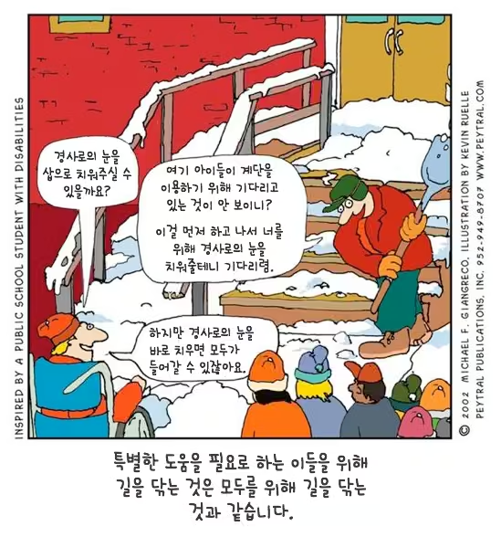
“Clearing the path for those who need special help is the same as clearing the path for everyone." Inspired by public school students with disabilities - Illustrator Kevin Alley
Takashi Hasumi, who pursues universal design, served as jury chairman in a public facility architectural design competition. Although the public facility was a two-story building, there was no elevator in the design. So he asked the jury members whether an elevator should obviously be installed. The jury members who heard this question showed negative reactions, with some opposing because there were no disabled people among building users, and some criticizing that young people just seek convenience. Takashi, wondering if there was a clever way to persuade the jury members, said this: “There is a meeting room on the second floor that can accommodate many people. An elevator can be used when moving luggage to this meeting room.” Only after hearing this did the jury members’ minds gradually move.
Ordinary people think that disabled lifts installed in subways, disabled toilets in public places, and disabled ramps are unrelated to themselves. This perception can also be found in developers and designers who make products (including software). That is, developers with this perception tend to make products that only disabled people can use when making things used by disabled people. For example, lifts that take disabled people in wheelchairs to subway platforms originated from this perception. However, if we shift from the special solution of making products used only by disabled people to the general solution of making products that ordinary people can also use, we would have installed elevators rather than wheelchairs for disabled people.
(omitted) What we need is a general or integrated solution that can be used by all people, including not only disabled people but also children, adults, and the elderly.7 Until now, as a first step to derive a more perfect general solution, we’ve learned about ‘users’ that we developers didn’t know about. From now on, let’s look at what problems exist in the software we’ve made.
— Chapter 2 “Developers Don’t Know Users”, 『Software Built by Humble Developers, Yet Arrogant in Design』, 2009, Shin Seung-hwan - Publisher detail page (Korean)
The reason I wrote this article was to convey my mental model8 about web accessibility in writing to inform the outside world that “web accessibility is not simply for screen readers only(special solution) but can be used comprehensively(integrated solution) as a design tool for UX and DX”.
I believe that caring about web accessibility together creates a better experience. After all, the basic composition of a web page is also a semantic markup document, and while structuring the composition of this article myself, I gained the insight that “web accessibility is a subset of user experience”.
Web accessibility technology is in a situation where interest and best practices are relatively uncommon compared to other web frontend technologies. I feel regret about the reality that best practices are still uncommon outside of institutionally mandated airline web services (Korean). I hope that awareness spreads that web accessibility is also an important frontend technology.
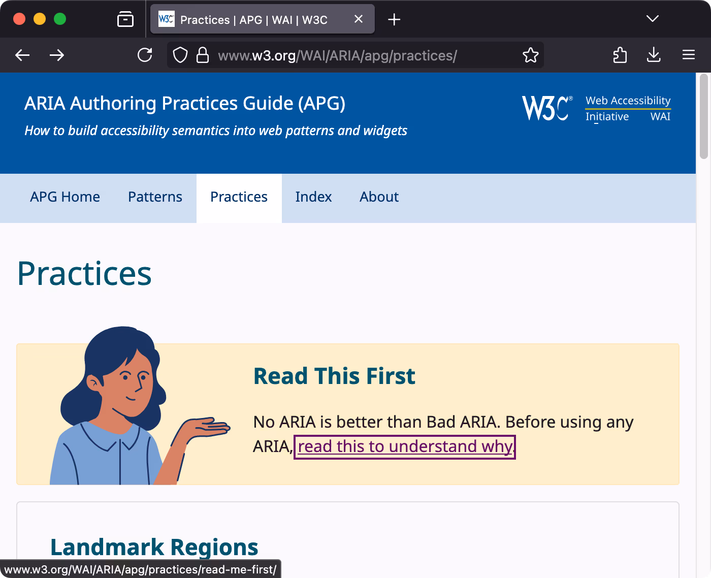
Finally, before considering ARIA usage, I remind you again of the “No ARIA is better than Bad ARIA.”2 principle that you must carefully decide after first securing basic accessibility through HTML.
After completing the first draft of the article, the opinions of accessibility expert Hyunjin were very helpful during the editing process.
There is a community called A11YKR that deals with accessibility and inclusive web design.
Through this channel, I was able to receive editing opinions from Hyunjin several times. It’s a newly created community, so please participate a lot through the Discord server.
msy suggested mentioning testing-library, a tool that prioritizes the accessibility tree.
I chose materials centered on those that are easy to practice immediately, as I want to recommend learning through hands-on practice.
Inclusive Components: A blog containing various inclusive web interface design patterns.
Logical Design and HTML5 Outline Algorithm (Korean): An article that considers React component design based on the logical design of HTML, the foundation of the web, and briefly examines the outline algorithm.
ARIA Authoring Practices Guide | W3C: A guide where W3C directly and kindly introduces examples of various UI patterns with accessibility in mind.
Open UI: One of the W3C Community Groups, a community that organizes and researches best practices for UI components that are not in the basic HTML specification and require separate implementation.
Switch UI, implemented by extending the <input type="checkbox" /> element, is a representative UI pattern not provided by HTML. In this case, accessibility hints can be provided through switch among ARIA Roles. ↩︎
The paragraph with the message “No ARIA is better than Bad ARIA” was written by directly referencing the “No ARIA is better than Bad ARIA.” principle introduced in the top banner of the W3C APG Practices page and the linked document.
For example, recommending design based on basic Form Web API for text input interactions, using aria-pressed for toggle buttons, aria-busy for loading components, managing and styling disabled states based on disabled and aria-disabled attributes, and recommending the use of CSS pseudo-classes already introduced earlier. ↩︎
Universal Design: For Creating a Warm Society (『유니버셜 디자인: 따뜻한 사회 조성을 위한』), 2005, Sejong Publishing, Hasumi Takashi ↩︎
Mental models refer to personal understanding and beliefs about the system currently being used (web, app, or other products). It’s a term derived from user experience research. See Mental Models and User Experience Design | nngroup↩︎

